How to Create Reading Rationales Posters for Presenting Books
"Consciously unconscious" is the motto of the so-called Reading Rationales. This classification standard makes the emotional approach to books visible from the customer's perspective and can be used accordingly. This works through the coordinated interplay of images, colors, typography and language style, for example in the design of a book cover. In this way, not only genre and tonality can be identified at a glance, but also which reading needs the book serves. Reading Rationales make the emotional experience of reading tangible and thus create new inspiration and buying impulses in the variety of books.
The possible uses are numerous. In the bookshop, the categories of the Reading Rationales can be used to restructure the product range or curate recommendation tables for different product groups. Our colleagues Katrin and Lorina from the Marketing & Communication department designed posters for selected reading needs. We asked them how they went about it.
You designed posters for nine different Reading Rationales, how did you get started?
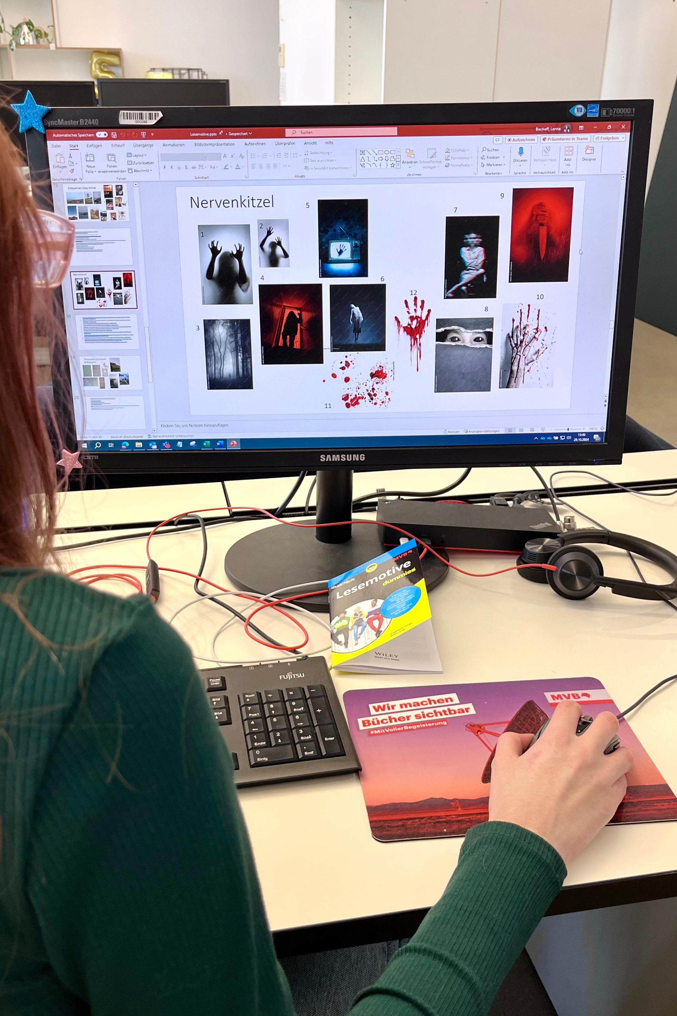
Lorina: We got a briefing from our Reading Rationales expert Stephanie Lange, who, at the time, was working on a pilot project alongside ten Swiss bookstores to introduce the Reading Rationales. We then took a close look at the corresponding motives and the requirements that go hand in hand with them. This includes not only understanding the underlying needs, but also the color scheme, tonality and fonts. The briefing helped us a lot here, as fortunately a lot of preliminary work had already been done with concrete examples.
Then, in line with these requirements, I selected several stock images for each of the Reading Rationales, which we then gradually narrowed down further and further. In some cases, the search was very easy, for example for "Thrills", where I immediately pictured scary figures and blood in my head. "Relaxing Entertainment" on the other hand was more difficult because, on the one hand, the need is more difficult to grasp and, on the other, because the boundaries to "Relaxing Literature" or "Light Reading for an older target group" can be blurred.
What happened after the first selection of images?
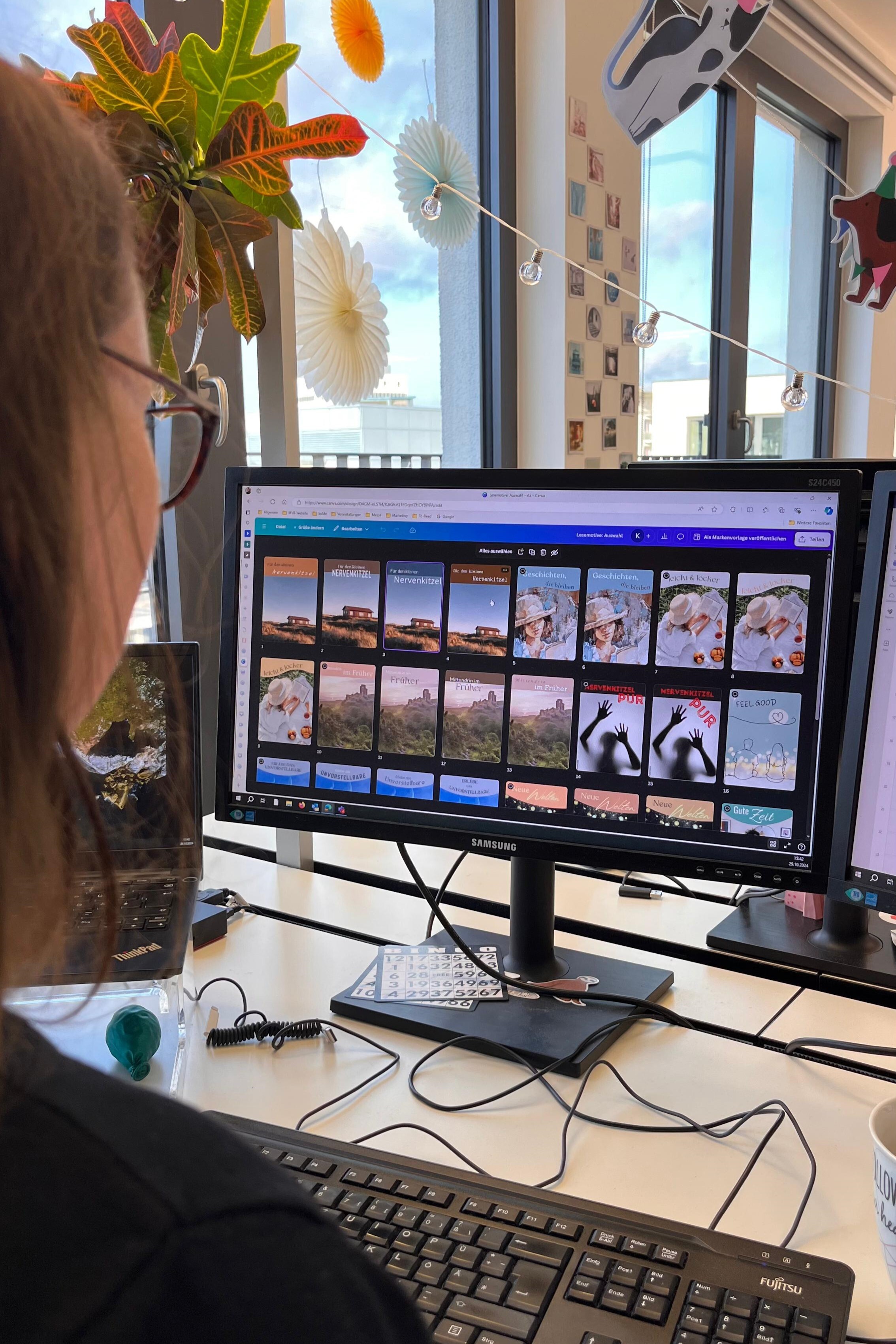
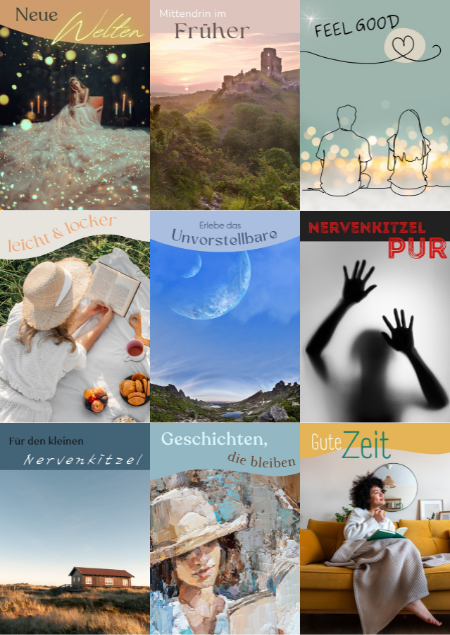
Katrin: Of course, the image alone is not enough. If you take a closer look at posters in bookshops, they are always slightly edited and provided with additional design elements and texts to complete the picture. Here, too, the Reading Rationales specifications can not only be applied perfectly, but must also be taken into consideration to create a coherent message. In the previous image selection, we had concentrated on the individual posters. In the next step, we wanted to find a common visual bracket that also incorporated the textures, colors and shapes of the elements. That was quite tricky at times.
Speaking of text. What is important to consider?
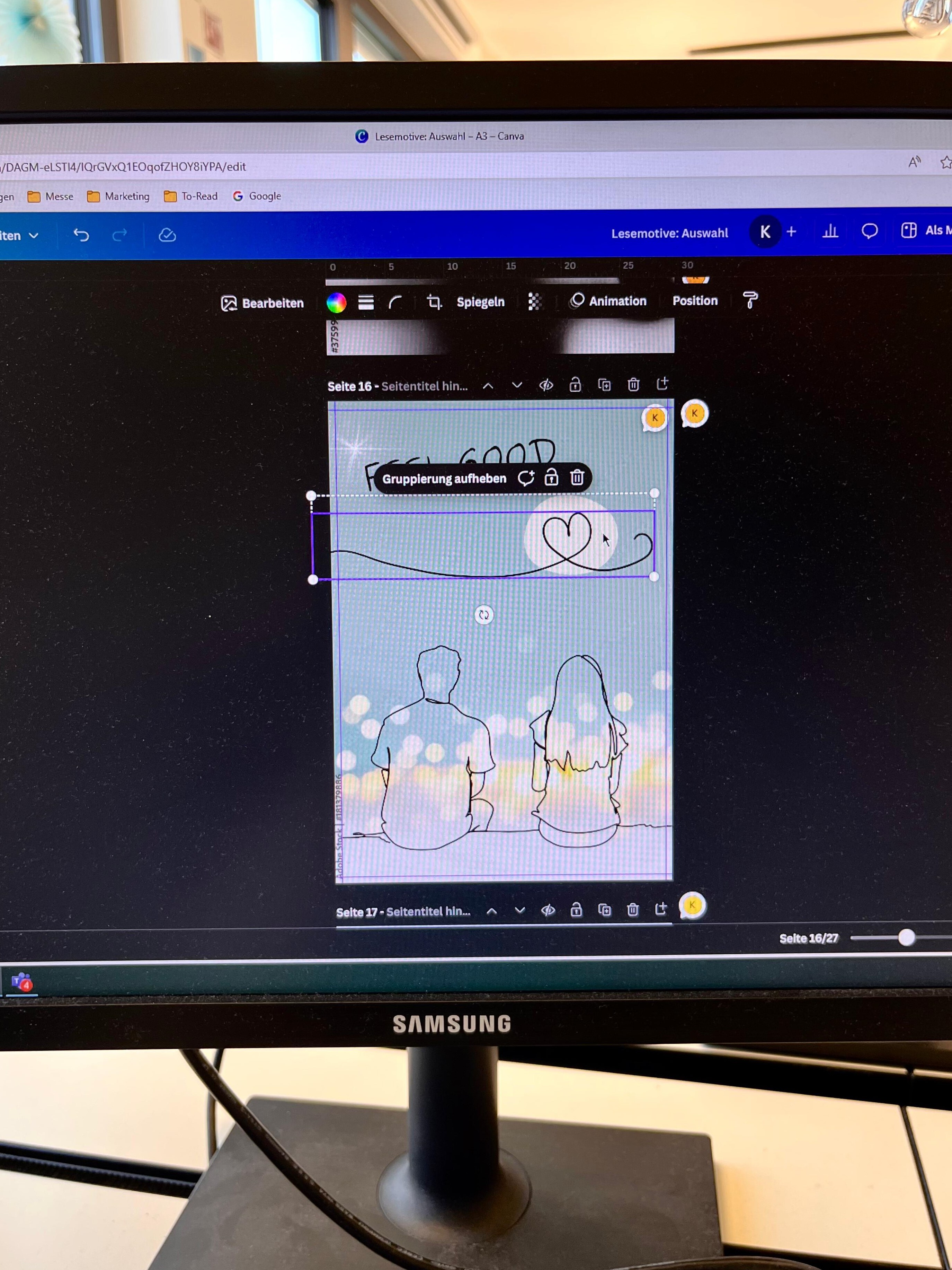
Lorina: The Swiss pilot bookshops had already brainstormed initial suggestions for some of the Reading Rationales. We were therefore able to just fine tune some of the claims, while we had to start from scratch with others. It is important to combine both the genre and the reading need in one claim and then choosing the right font.
Using the poster claim for "Diving into Fantasy" as an example, terms such as "adventure", "unknown" and "other worlds" alluded to the genre and "in the middle of it" and "experience" to the need for immersion. This resulted in the claims "In the Midst of Adventure", "Experience the Unknown" and "At Home in Other Worlds".
As with the previous steps, we designed several versions for each Reading Rationales and finally agreed on the final claims together with Stephanie.
The posters are finished, now what?
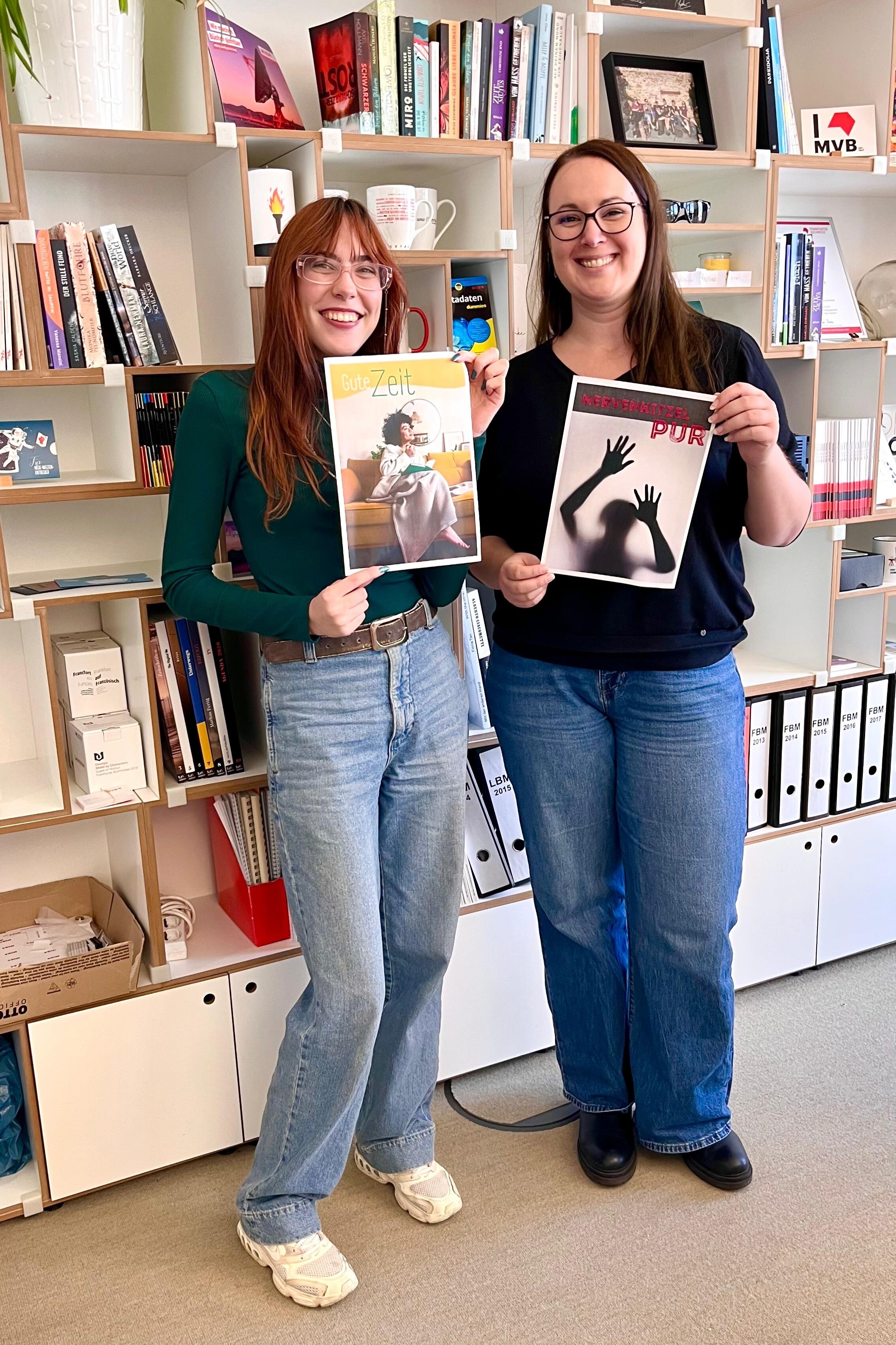
Katrin: After a final polish, the successful teamwork came to an end. This was the second design round for me, after I had the pleasure of designing the posters for the presentation at the Ludwig bookstore in Leipzig earlier this year. It is always exciting to see how versatile the Reading Rationales can be used and thus contribute to a well-rounded sales experience. The new posters are now available to all bookshops free of charge on request to support their own presentation of the books according to the Reading Rationales.
More insights and information:
All Reading Rationales posters designed by Katrin and Lorina:
More information on the Reading Rationales.
More information on the pilot project in Switzerland.